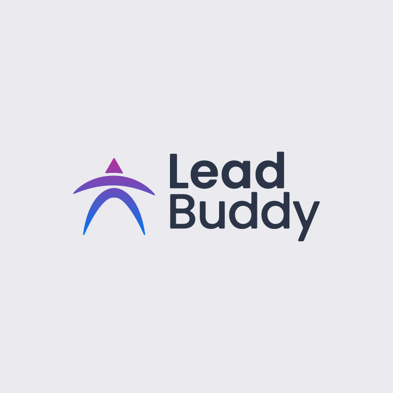
LeadBuddy
Modern SaaS Identity for a Growth-Focused Platform
Details
- Client
- LeadBuddy (Concept)
- Industry
- SaaS / Technology / Startup
- Year
- 2024
Scope
- Services
-
- Logo Concept
- Visual Direction
- Brand Exploration
- Tools
-
- Adobe Illustrator
- Figma
The Brief
LeadBuddy was explored as a conceptual SaaS platform designed to support growth-driven teams through clarity, guidance, and smart digital solutions. The goal was to create a modern identity that feels approachable, trustworthy, and scalable across digital products.
Concept & Thinking
The identity is centered around a simplified human-inspired symbol combined with an upward directional form. The concept reflects guidance, progress, and partnership—positioning the brand as a supportive “buddy” within a fast-moving tech environment.
- Abstract human form symbolizing support and collaboration
- Upward motion representing growth, progress, and momentum
- Minimal geometry for clarity in digital environments
- Balanced color palette blending trust, innovation, and approachability
Logo Symbolism
The icon represents a guided figure moving forward, subtly reinforced by an upward element that suggests progress and leadership. This symbolism aligns with SaaS products focused on user growth, performance tracking, and digital assistance.
Typography
The wordmark uses Poppins, a modern geometric sans-serif chosen for its clarity, friendliness, and strong on-screen performance. Semibold weight is applied to “Lead” to establish hierarchy and emphasis, while Medium weight is used for “Buddy” to maintain balance and approachability.
This contrast subtly reinforces leadership and support within the brand name. The result is a system that follows clear logic and performs effortlessly across digital portfolios and product interfaces.
Color Palette
The color system combines a blue-to-pink gradient that represents growth, guidance, and human-centric technology. The blue tone conveys trust and digital reliability, while the pink accent introduces warmth and personality without overpowering the identity.
Growth Gradient
#0077EF → #CC278F
Charcoal Type
#2B3547
Soft Neutral
#EAEAEF
Application:
Typography is set in the deep charcoal tone (#2B3547) to ensure strong readability and a refined, modern feel.
The soft neutral background (#EAEAEF) keeps the interface light, clean, and visually calm, allowing the symbol and gradient to remain the focal point.
Logo Variations

Real-World Applications
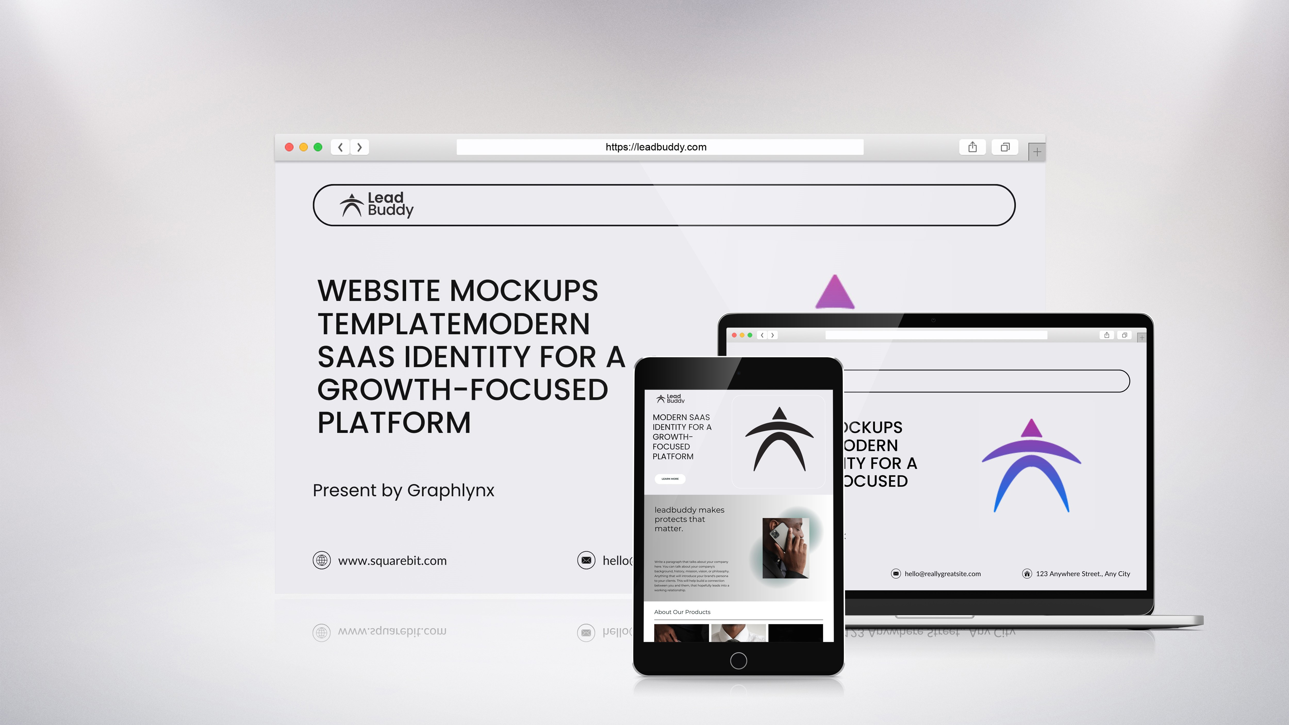
SaaS Platform
Web application interface
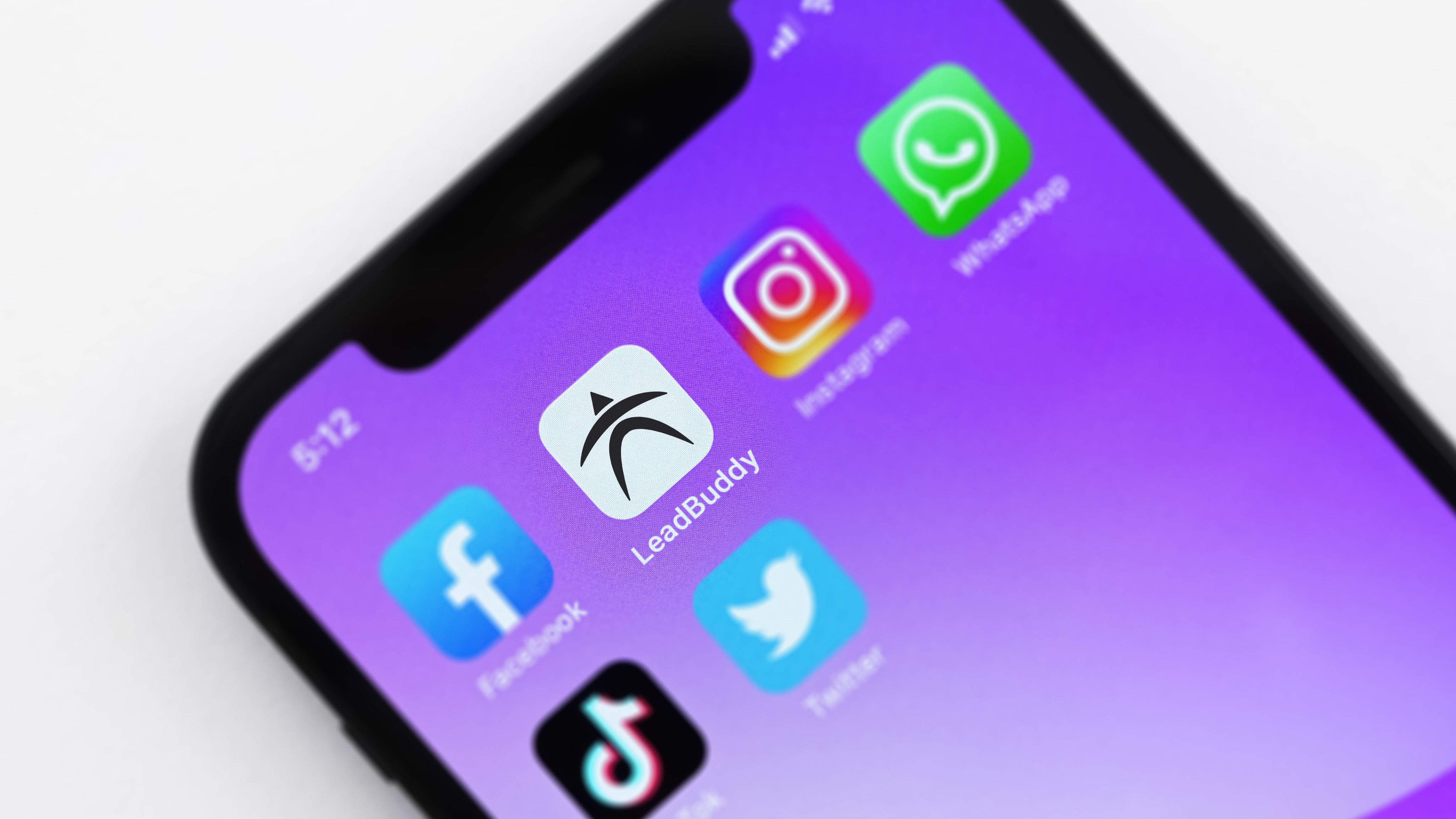
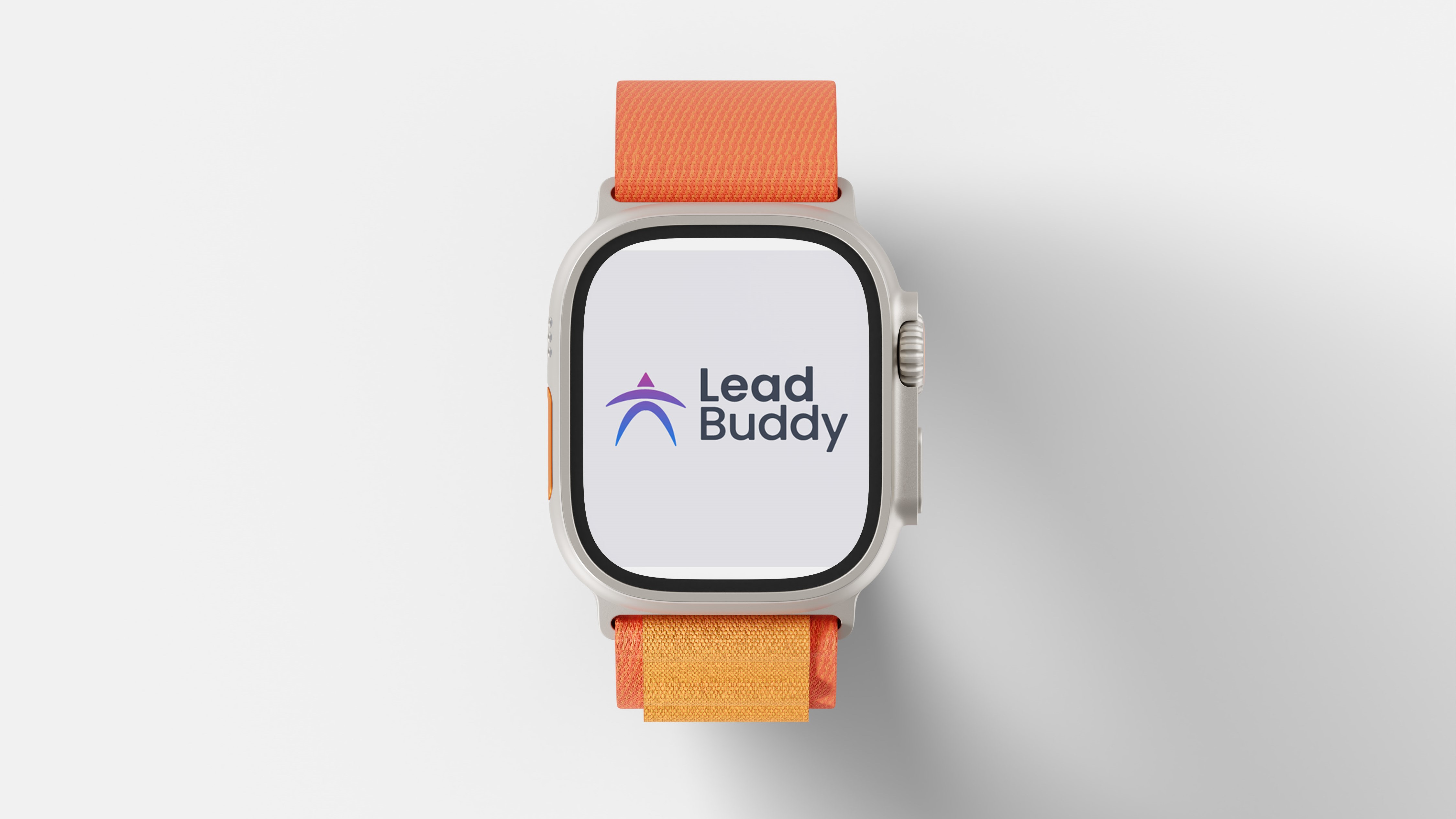
Mobile App
iOS and Android launcher
User Onboarding
Welcome screens
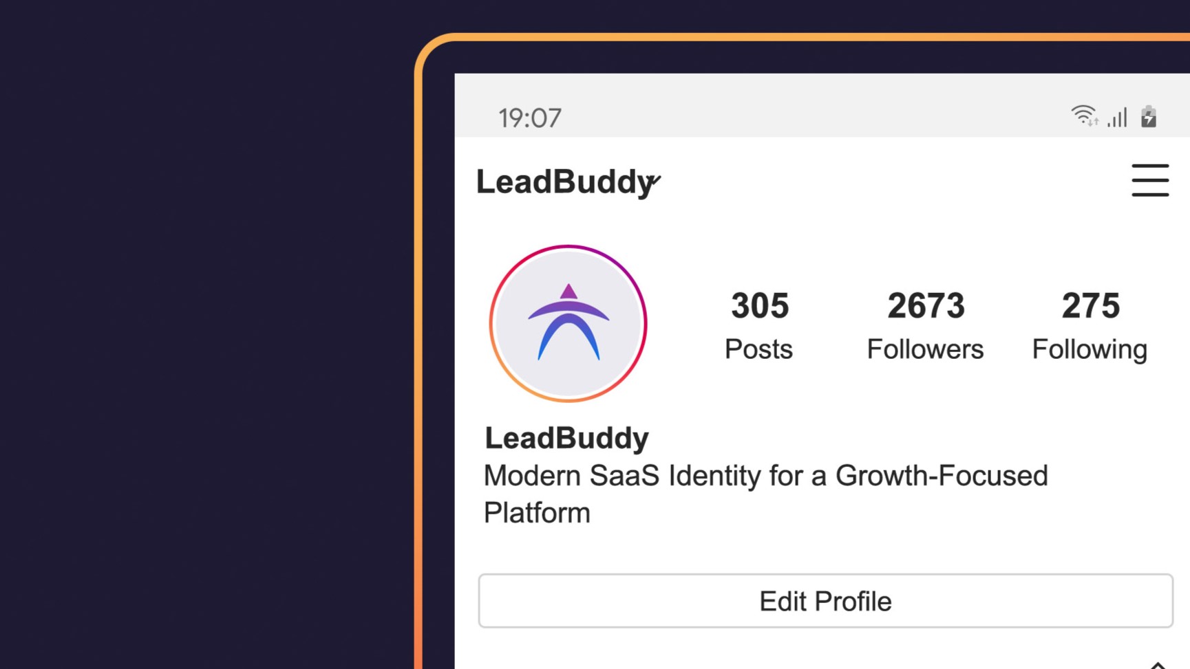
Social Media
Instagram page visuals
Final Outcome
The final identity presents LeadBuddy as a modern, growth-oriented SaaS brand with a clean and adaptable visual system. Designed for digital-first applications, the logo performs consistently across dashboards, web platforms, and startup branding touchpoints.