VUESO
Power in Perspective
Details
- Client
- VUESO (Concept)
- Industry
- Holding Company
- Year
- 2026
Scope
- Services
-
- Corporate Identity
- Logo Design
- Brand Strategy
- Key Values
-
- Strength
- Vision
- Scalability
The Brief
VUESO was developed as a conceptual holding brand designed to represent strength, leadership, and long-term scalability. The objective was to create a modern, timeless identity capable of standing alongside globally recognized corporate brands.
The logo needed to feel powerful yet minimal, with a strong typographic presence supported by a distinctive symbol that communicates ambition and structural integrity.
Concept & Thinking
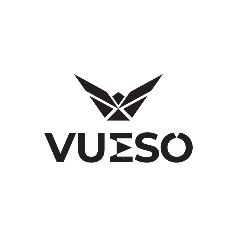
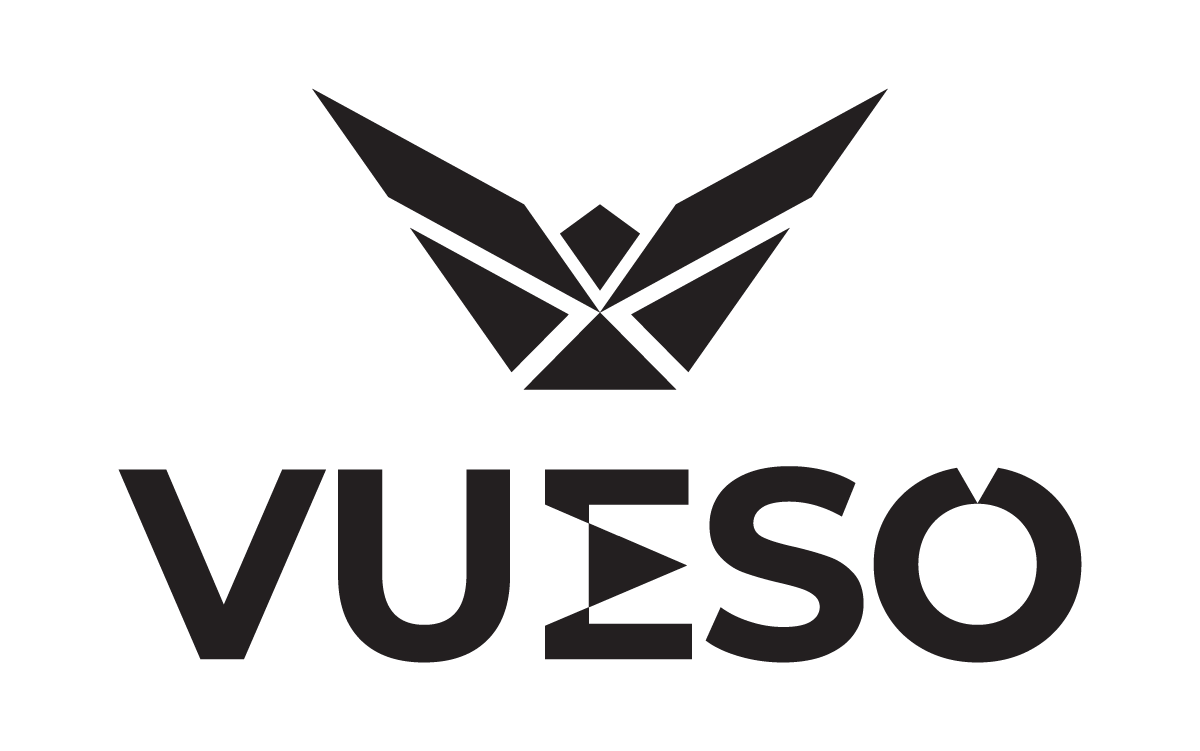
The identity is built around a geometric abstract symbol that merges the front view of a soaring eagle with a bold “V” form. The eagle represents vision, authority, and strategic oversight, while the integrated letterform directly anchors the symbol to the VUESO name.
- Geometric Eagle Motif: Symbolizing leadership and strategic vision.
- Subtle “V” Integration: For strong brand linkage and ownership.
- Balanced Proportions: Ensuring clarity at all scales.
- Minimal Detailing: To preserve recognition and impact.
Logo Symbolism
The eagle form represents strategic vision and elevated perspective, qualities central to a holding company overseeing diverse ventures. The structured, angular composition conveys stability and control, reinforcing long-term growth and corporate strength.
Typography
The typography uses Montserrat Extra Bold, a modern geometric sans-serif chosen for its clarity, strength, and contemporary corporate presence. Its clean structure complements the angular symbol, creating a unified and confident visual system.
Color Direction
The black and white palette reinforces authority, simplicity, and timelessness. High contrast ensures strong visibility across all platforms.
Corporate Black
#231F20
Pure White
#FFFFFF
Palette Logic:
This allows the symbol to stand confidently without reliance on decorative color. It is confident without being loud.
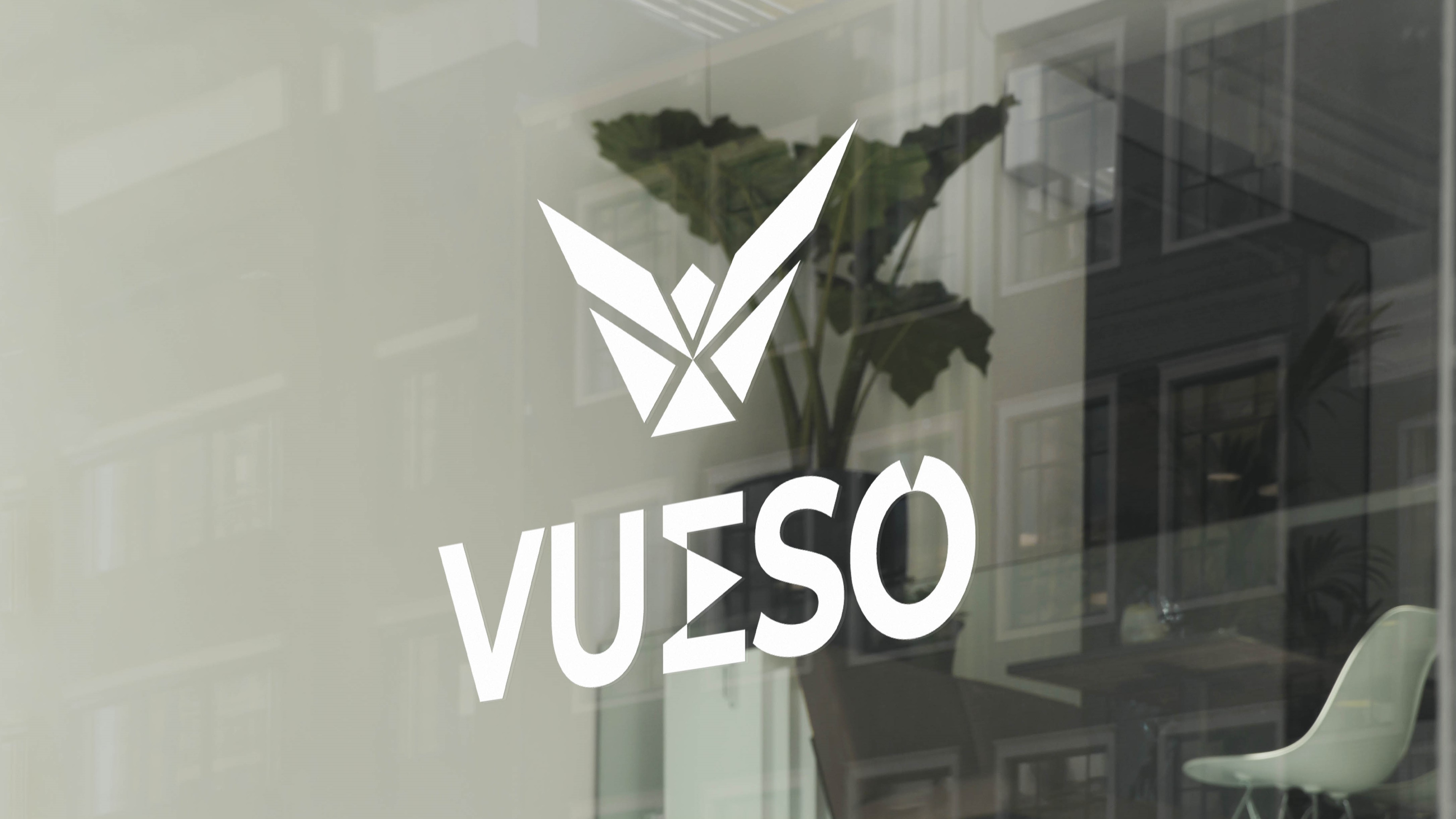
Logo Variations

Real-World Applications
Corporate Office
Lobby signage
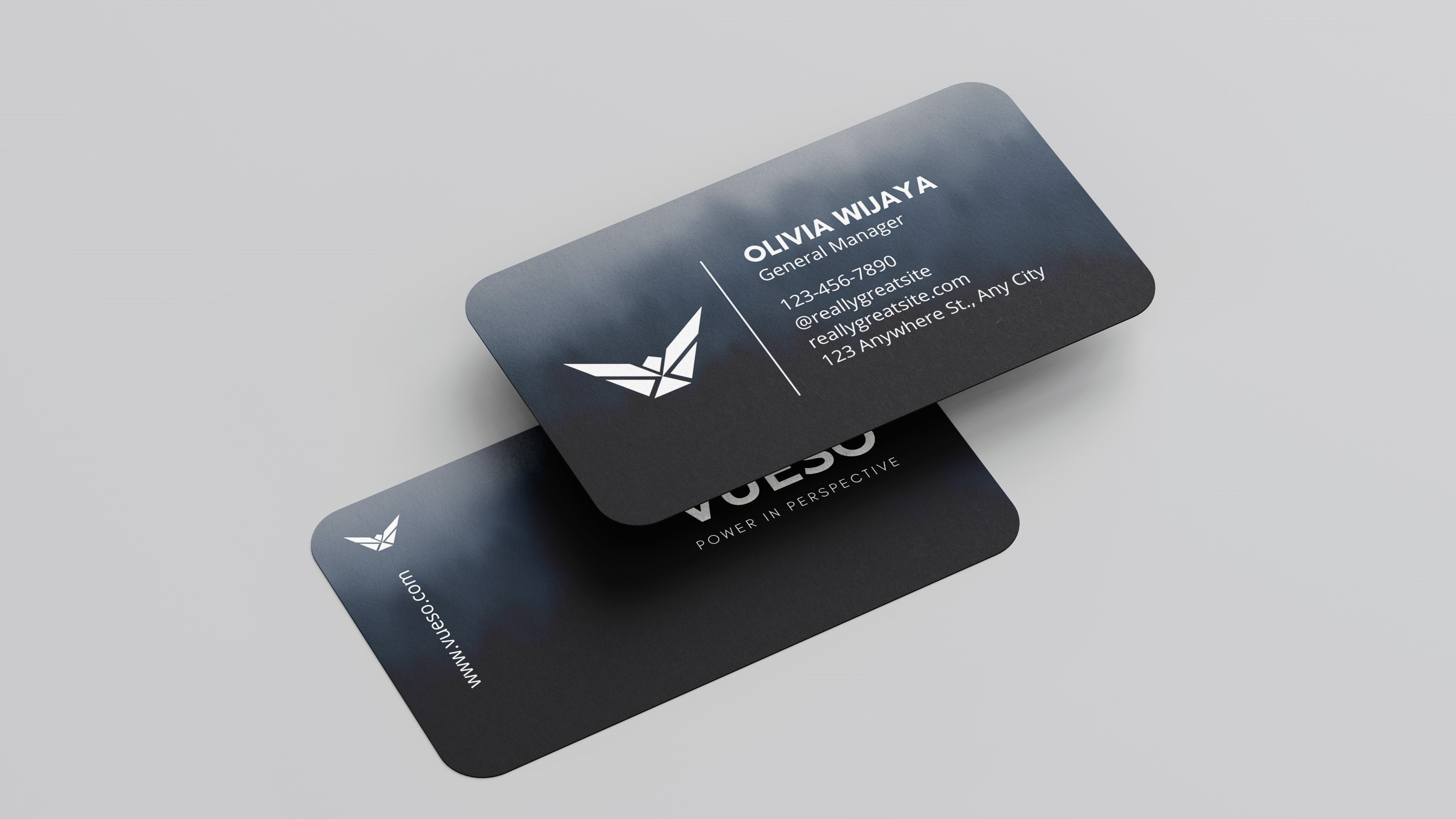
Stationery
Executive cards
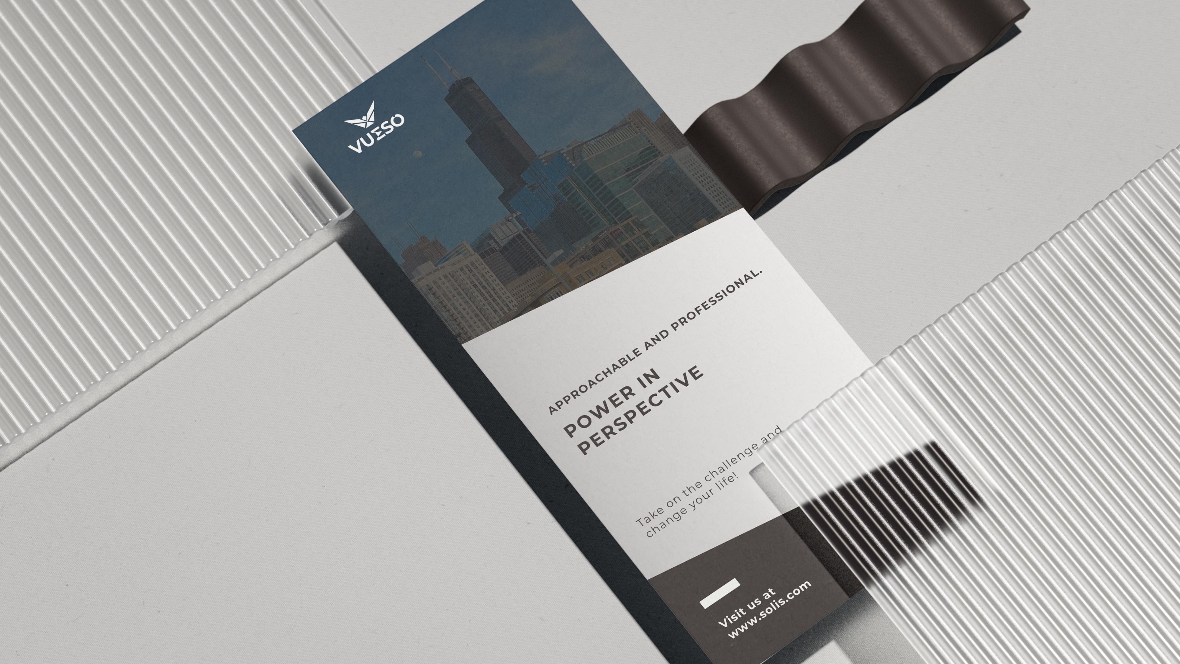
Investor documents
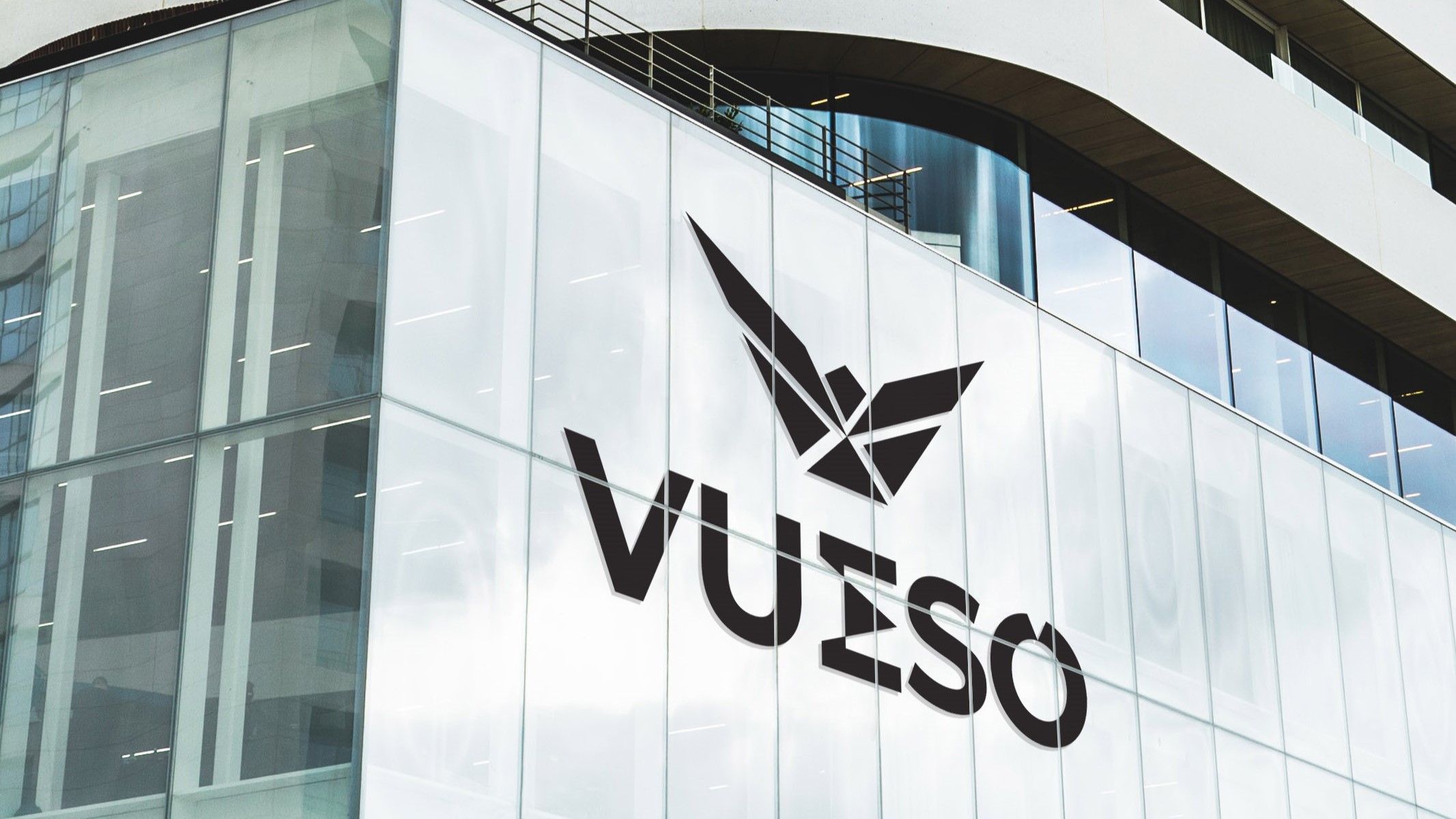
Exterior
HQ Facade
Final Outcome
The final identity presents VUESO as a strong, scalable holding brand with global potential. Designed for adaptability across corporate environments and digital platforms, the logo maintains clarity and presence in every application. Minimal. Structured. Built for expansion.